FAQs
Frequently Asked Questions
General
What does Pheno-Ranker do?
Pheno-Ranker is an open-source toolkit developed for the semantic similarity analysis of phenotypic and clinical data. It natively supports GA4GH standards, such as Phenopackets v2 and Beacon v2, using as input their JSON/YAML data exchange formats. Beyond these specific standards, Pheno-Ranker is designed to be highly versatile, capable of handling any data serialized into JSON, YAML, and CSV (categorical) formats, extending its utility beyond the health data domain. Pheno-Ranker transforms hierarchical data into binary digit strings, enabling efficient similarity matching both within cohorts and between individual patients and reference cohorts.
Is Pheno-Ranker free?
Yes. See the license.
Is the Web App UI still available?
The Web App UI is a legacy interface that will be supported until 2027. For new workflows, use the maintained pheno-ranker command-line interface locally or through Docker.
The Web App UI is available at https://pheno-ranker.cnag.eu.
Playground credentials:
Username: pheno
Password: ranker
Can I export term coverage and intermediate files?
Yes. It is possible to export a file indicating coverage for each term (i.e., 1D-keys) as well as all intermediate files using the flag --e.
On top of that, in patient mode, alignment files can be obtained by using --align.
How can I exclude a given variable?
To exclude a specific variable, you can use one of the following methods:
- Utilize the
--include-termsor--exclude-termsoptions in the command-line interface (CLI). - Implement a regular expression (regex) in the configuration file using the
exclude_variables_regexparameter. - Assign a weight of zero to the variable in a weights file (indicated by the
--wflag). This approach offers the most detailed control over variable exclusion.
Do you have estimates on CPU time and RAM depending on size?
Expected times and memory using an imported CSV with 19 columns:
| Rows | Cohort | Patient | ||
|---|---|---|---|---|
| Number | Time | RAM | Time | RAM |
| 100 | 0.5s | <1GB | <0.5s | <1GB |
| 1K | 1s | <1GB | <0.5s | <1GB |
| 5K | 15s | <1GB | <0.5s | <1GB |
| 10K | 1m | <1GB* | <1s | <1GB |
| 50K | 1h | <1GB* | 3s | <1GB |
| 100K | - | - | 6s | <1GB |
| 1M | - | - | 1m | <4GB |
1 x Intel(R) Xeon(R) W-1350P @ 4.00GHz - 32GB RAM - SSD
After reaching 5,000 rows, Pheno-Ranker switches to a RAM-efficient mode, calculating the full symmetric matrix without storing it in memory. However, this trade-off makes the computation slower. You can adjust this threshold using the --max-matrix-records-in-ram argument.
For large cohorts where a dense N x N text matrix is not required, use --matrix-format mtx to write a sparse Matrix Market coordinate file. This mode is always RAM-light, stores one triangle of the symmetric matrix, writes only non-zero values, and does not use the dense matrix cache controlled by --max-matrix-records-in-ram.
pheno-ranker -r individuals.json --matrix-format mtx -o matrix.mtx
The mtx output is intended for downstream tools that understand Matrix Market files. It can be combined with --cytoscape-json, because graph export is generated directly from the binary comparison hashes rather than by reading the matrix file.
For very large graphs, filter edges explicitly:
# Hamming distance: keep close pairs
pheno-ranker -r individuals.json --cytoscape-json --graph-max-weight 10

# Jaccard similarity: keep highly similar pairs
pheno-ranker -r individuals.json --similarity-metric-cohort jaccard --cytoscape-json --graph-min-weight 0.7
Can I use pedigrees term in BFF?
A priori, you can, but the term pedigrees is excluded by default via configuration file. Pedigrees are often case-related, so the information is not relevant for comparison to other cases. If you want to include it, please modify the default configuration file and use it with the --config <your-config-file> option.
How does Pheno-Ranker treat empty and missing values?
Pheno-Ranker uses categorical variables to define the binary_digit_vector. Any key that contains an empty value such as null, {}, or [] is discarded. We also deliberately discard keys with missing values (namely NA and NaN). On the other hand, any other string such as Unknown or No is accepted as values and will be incorporated as a category. Thus, if you want missing values to be included as a category, we recommend replacing them with another string (e.g., Unknown).
Now, in the context of one-hot encoded data, missing values are typically represented by zeros, and that's exactly Pheno-Ranker's approach.
Let's consider the following example:
[
  {
    "id": "PR_1",
    "Name": "Foo"
  },
  {
    "id": "PR_2",
    "Name": "Bar"
  },
  {
    "id": "PR_3"
  },
  {
    "id": "PR_4",
    "Name": null
  },
  {
    "id": "PR_5",
    "Name": "NA"
  }
]
We have only one variable (i.e., category) named Name. The first two individuals contain valid values, the third does not contain the key, the fourth has it as null, and the fifth has NA.
The coverage (see "Can I export term coverage and intermediate files?" above) for the terms will be the following:
{
   "cohort_size" : 5,
   "coverage_terms" : {
      "Name" : 2,
      "id" : 5
   }
}
In which we see that the variable Name only has coverage for 2 out of 5 individuals.
If we run a job with the default metric (Hamming distance) and --include-terms Name, the global hash will look like this:
{
   "Name.Bar" : 1,
   "Name.Foo" : 1
}
The binary-digit-vector will look like this:
{
  "PR_1": "01",
  "PR_2": "10",
  "PR_3": "00",
  "PR_4": "00",
  "PR_5": "00"
}
The resulting matrix.txt will look like this:
| PR_1 | PR_2 | PR_3 | PR_4 | PR_5 | |
|---|---|---|---|---|---|
| PR_1 | 0 | 2 | 1 | 1 | 1 |
| PR_2 | 2 | 0 | 1 | 1 | 1 |
| PR_3 | 1 | 1 | 0 | 0 | 0 |
| PR_4 | 1 | 1 | 0 | 0 | 0 |
| PR_5 | 1 | 1 | 0 | 0 | 0 |
In this context, the distance from PR_1 to PR_2 is 2 (indicating they differ in two positions), while the distance from PR_1 to PR_3, PR_4, and PR_5 is only 1. This discrepancy arises because an empty value contributes less to the distance calculation than a non-empty one. While this discrepancy may often be acceptable since the data will still fall into different clusters, an alternative solution to mitigate this issue is to exclude the variable Name entirely when running Pheno-Ranker. Another, less drastic approach is to employ the Jaccard metric (--similarity-metric-cohort jaccard), which is less sensitive to empty values. With the Jaccard index, the resulting matrix will be as follows:
| PR_1 | PR_2 | PR_3 | PR_4 | PR_5 | |
|---|---|---|---|---|---|
| PR_1 | 1 | 0.000000 | 0.000000 | 0.000000 | 0.000000 |
| PR_2 | 0.000000 | 1 | 0.000000 | 0.000000 | 0.000000 |
| PR_3 | 0.000000 | 0.000000 | 1 | 0.000000 | 0.000000 |
| PR_4 | 0.000000 | 0.000000 | 0.000000 | 1 | 0.000000 |
| PR_5 | 0.000000 | 0.000000 | 0.000000 | 0.000000 | 1 |
When handling missing values within the context of Pheno-Ranker, it's essential to consider the specific characteristics of your dataset, the nature of missingness, and the potential impact on downstream analyses
Should I use Hamming distance or Jaccard index?
This depends on the nature of your data. As a rule of thumb, if your data has more than 30% missing values, use Jaccard; otherwise, you can use Hamming. Note also that Hamming distance calculation is faster than Jaccard (O(N) vs. O(N) to O(N log N)), and this difference becomes noticeable when comparing thousands of variables.
We recommend checking results with both and assessing them rationally.
Can I use pre-computed data?
Yes, starting with version 1.02, it is possible to use pre-computed data. In general, you don't want to do this, as the calculation is fast enough to be started from scratch each time.
There is an exception when you have to compare patients multiple times to a very large (>2K) reference cohort(s). For instance, when matching patients against the OMIM database.
First, you have to export intermediate files, make sure you select the terms you want to include or exclude as they will be final:
pheno-ranker -r individuals.json -e my_export_prefix --include-terms phenotypicFeatures
Then, you can re-use the exported data using the flag --prp|precomputed-ref-prefix. Note that that the include/exclude terms only will apply to the target as the reference vector is fixed:
pheno-ranker --prp my_export_prefix -t patient.json --include-terms phenotypicFeatures --sort-by jaccard
Where my_export_prefix is the prefix you used for the export with -e. The files used will be *.{global_hash,ref_hash,ref_binary_hash,coverage_stats}.json.
Note that the exported JSON files can also be gzipped.
As the global vector is built using the reference cohort(s), it's really not that important. However, one value that can be affected is the INTERSECT-RATE(%), as it uses all the variables for the target. If you don't restrict it, it may account for terms not present in the precomputed data.
Pre-processing
How can I create a JSON file consisting of a subset of individuals?
You can use the tool jq:
# Let's assume you have an array of "id" values in a variable named ids
ids=( "157a:week_0_arm_1" "157a:week_2_arm_1" )

# Use jq to filter the array based on the "id" values
jq --argjson ids "$(printf '%s\n' "${ids[@]}" | jq -R -s -c 'split("\n")')" 'map(select(.id | IN($ids[])))' < individuals.json > subset.json
I have noticed that in cohort mode, Pheno-Ranker takes as input an array of objects. Does it also support independent JSON files (one per patient)?
The simple answer is yes. However, what actually happens under the hood is that each independent file is treated as a cohort, and a prefix (defaulting to 'CX_') is added to the primary_key ID. This does not affect the results. Additionally, in colored MDS plots, each patient represented in separate files will be distinguished with a different color.
If you prefer to combine all independent JSON files into a single JSON array, consider using one of the following alternatives:
With the tool jq:
jq -s '.' *.json > combined.json
Alternatively, if you want to resort to Bash:
See Bash code:
#!/bin/bash

# Start the JSON array
echo '['

# Concatenate the JSON files
first=1
for file in *.json; do
    if [[ $first -eq 1 ]]; then
        first=0
    else
        echo ','
    fi
    cat "$file"
done

# End the JSON array
echo ']'
Do you account for BFF/PXF schema versions?
As of August 2024, we do not explicitly account for BFF/PXF schema versions. In some cases, BFF data may not include a version, requiring us to infer changes. However, most schema updates are downstream and do not impact term-level data. As a result, the overall effect of comparing data from different schema versions is typically minimal. We assume that users are aware of the versions they are working with and understand the implications of using data from different schema versions.
Post-processing
How do I store Pheno-Ranker's binary string vectors in a CSV
First, export intermediate files using the following command:
pheno-ranker -r individuals.json -e my_export_data
This command will generate a set of intermediate files, and the one you'll need for queries is my_export_data.ref_binary_hash.json.
To convert the JSON data to CSV, you can use various methods, but we recommend using the jq tool:
jq -r 'to_entries[] | [.key, .value.binary_digit_string] | @csv' < my_export_data.ref_binary_hash.json | awk 'BEGIN {print "id,binary_digit_string"}{print}' > output.csv
The results are now stored at output.csv
Please note that from version 1.05 the file my_export_data.ref_binary_hash.json also has the string zlib-compressed and encoded in base64. For storing it you could use:
jq -r 'to_entries[] | [.key, .value.zlib_base64_binary_digit_string] | @csv' < my_export_data.ref_binary_hash.json | awk 'BEGIN {print "id,zlib_base64_binary_digit_string"}{print}' > output.csv
If you are storing compact binary-vector representations, you may also want to check the QR-codes page.
Can I Perform MDS with Jaccard Indices?
Yes, you can perform Multidimensional Scaling (MDS) using a matrix of Jaccard indices. To use MDS, which typically requires dissimilarity data, you'll need to convert your Jaccard similarity matrix into a dissimilarity matrix. This is done by subtracting the Jaccard similarity scores from 1, where the formula is:
Where: ( D ) is the dissimilarity. ( J ) is the Jaccard index.
This conversion ensures that higher similarities translate into shorter distances for MDS, facilitating accurate low-dimensional representations of the data.
Here, R is used only for post-processing an existing matrix.txt. If you want to launch pheno-ranker from inside R, see Use from R.
Example R code:
# Load the matrix of Jaccard similarities from a text file
data <- as.matrix(read.table("matrix.txt", header = TRUE, row.names = 1, check.names = FALSE))

# Convert Jaccard similarity matrix to a dissimilarity (distance) matrix
dissimilarity_matrix <- 1 - data

# Perform classical Multidimensional Scaling (MDS) using the dissimilarity matrix
# 'eig=TRUE' allows the function to return eigenvalues
# 'k=2' sets the number of dimensions for the MDS output
fit <- cmdscale(dissimilarity_matrix, eig=TRUE, k=2)

# Additional analysis and plotting code here
...
Can I convert a Hamming distance matrix to a similarity matrix?
First of all, if you are seeking a similarity metric, you might want to consider using jaccard as a metric. However, if you wish to convert a distance-based matrix to a similarity matrix, you can use the following formula:
Where: ( S ) is the similarity. ( d ) is the Hamming distance. ( n ) is the number of characters compared in the Hamming distance.
Here, R is used only for post-processing an existing matrix.txt. If you want to launch pheno-ranker from inside R, see Use from R.
Example R code:
# Load the matrix of Hamming distances from a text file
data <- as.matrix(read.table("matrix.txt", header = TRUE, row.names = 1, check.names = FALSE))

# Set n (extracted with --export option)
n = 100

# Convert Hamming distance to a similarity matrix
similarity_matrix <- 1 - (data / n)

# Additional analysis and plotting code here
...
How can I convert a Hamming distance matrix to a standardized matrix?
We recommend using R for this task. See example below:
Here, R is used only for post-processing an existing matrix.txt. If you want to launch pheno-ranker from inside R, see Use from R.
Example R code:
# Load the matrix of Hamming distances from a text file
data <- as.matrix(read.table("matrix.txt", header = TRUE, row.names = 1, check.names = FALSE))

# Step 2: Extract numeric matrix
numeric_matrix <- as.matrix(data)  # Assumes non-numeric first column is already set as row.names

# Step 3: Standardize to z-scores
z_score_matrix <- scale(numeric_matrix)

# Step 4: Reassemble the matrix with labels
standardized_matrix <- as.data.frame(z_score_matrix)
row.names(standardized_matrix) <- row.names(data)

# Step 5: Save the standardized matrix
write.table(standardized_matrix, "standardized_matrix.txt", sep = "\t", quote = FALSE, col.names = NA)
Can I create network/graph plots from Pheno-Ranker output data?
Yes. Pheno-Ranker can generate graph data in JSON format, compatible with the Cytoscape ecosystem. The graph is generated directly from pairwise comparison data and can be produced independently from the dense matrix.txt output.
To create a graph, run:
pheno-ranker -r individuals.json --cytoscape-json cytoscape_graph.json
For large graphs, filter edges explicitly:
# Hamming distance: keep close pairs
pheno-ranker -r individuals.json --cytoscape-json cytoscape_graph.json --graph-max-weight 10

# Jaccard similarity: keep highly similar pairs
pheno-ranker -r individuals.json --similarity-metric-cohort jaccard --cytoscape-json cytoscape_graph.json --graph-min-weight 0.7
If you want summary statistics for the graph, use --graph-stats together with --cytoscape-json:
pheno-ranker -r individuals.json --cytoscape-json cytoscape_graph.json --graph-stats my_graph_stats.txt
The file my_graph_stats.txt will include summary statistics and the shortest path between all nodes. Be aware that this calculation may be time-consuming for large graphs.
Alternatively, you can use R for more graphical options. Here are some examples using the qgraph and igraph packages:
See code
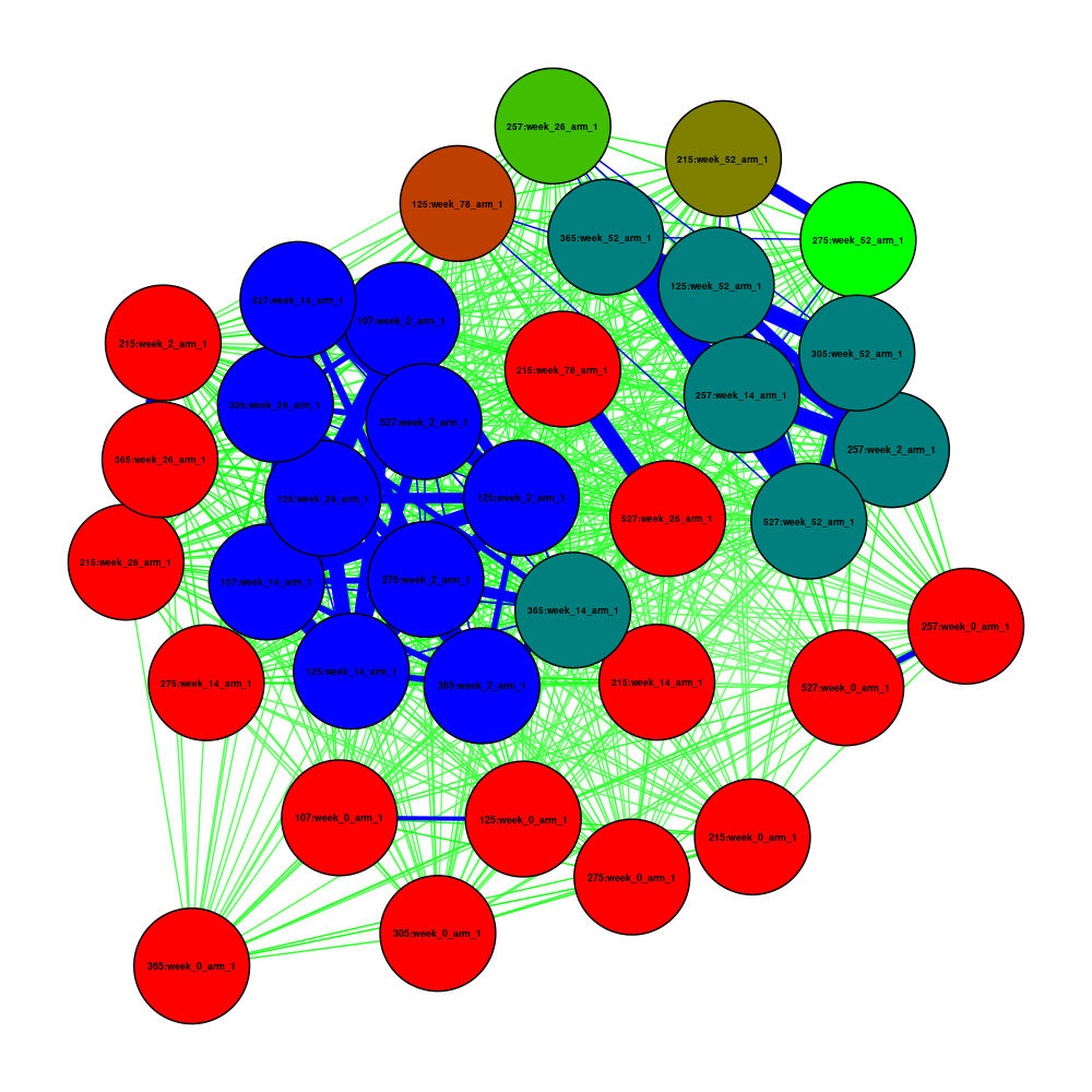
First, we run Pheno-Ranker in cohort mode using jaccard as a metric:
pheno-ranker -r individuals.json --similarity-metric-cohort jaccard
Now we plot the resulting matrix.txt file.
Coloring Nodes and Edges:
- Nodes: Colored based on the count of connections exceeding a specified threshold, using a gradient from red (fewer connections) to blue (more connections).
- Edges: Colored by weight, with blue for the strongest connections (weight > 0.90), green for strong connections (weight > 0.50), and red for weaker ones.
 # Install the necessary packages if not already installed
 if (!requireNamespace("qgraph", quietly = TRUE)) {
     install.packages("qgraph")
 }
 library(qgraph)
 data <- as.matrix(read.table("matrix.txt", header = TRUE, row.names = 1, check.names = FALSE))

 # Start PNG device
 png(filename = "qgraph.png", width = 1000, height = 1000,
     units = "px", pointsize = 12, bg = "white", res = NA)

 # Toggle for coloring the last node black
 colorLastNodeBlack <- FALSE  # Change to TRUE for black / FALSE to retain original color

 # Function to determine color based on threshold values
 getColorBasedOnThreshold <- function(value, thresholdHigh, thresholdMid, colorHigh, colorMid, colorLow) {
   if (value > thresholdHigh) {
     return(colorHigh)
   } else if (value > thresholdMid) {
     return(colorMid)
   } else {
     return(colorLow)
   }
 }

 # Apply this function to each node and edge
 node_thresholds <- apply(data, 1, function(x) sum(x > 0.9))
 max_node_threshold <- max(node_thresholds)
 min_node_threshold <- min(node_thresholds)
 normalized_node_thresholds <- (node_thresholds - min_node_threshold) / (max_node_threshold - min_node_threshold)

 # Color nodes based on normalized threshold
 node_colors <- colorRampPalette(c("red", "green", "blue"))(length(unique(normalized_node_thresholds)))
 node_colors <- node_colors[as.integer(cut(normalized_node_thresholds, breaks = length(node_colors), include.lowest = TRUE))]

 # Conditionally color the last node black
 if (colorLastNodeBlack) {
     node_colors[length(node_colors)] <- "black"  # Last node in black
 }

 # Edge colors with similar logic
 edge_colors <- apply(data, c(1,2), function(x) getColorBasedOnThreshold(x, 0.90, 0.50, "blue", "green", "red"))
 edge_colors <- matrix(edge_colors, nrow=nrow(data), ncol=ncol(data))

 # Create and plot the graph
 qgraph(data,
        labels=colnames(data),
        layout='spring',
        label.font=2,  # Bold labels
        vsize=10,      # Node size
        threshold=0.50,  # Edge visibility threshold
        shape='circle',
        color=node_colors,  # Node colors
        edge.color=edge_colors,  # Edge colors
        edge.width=1)  # Edge width

 # Close the device to save the PNG file
 dev.off()
See code
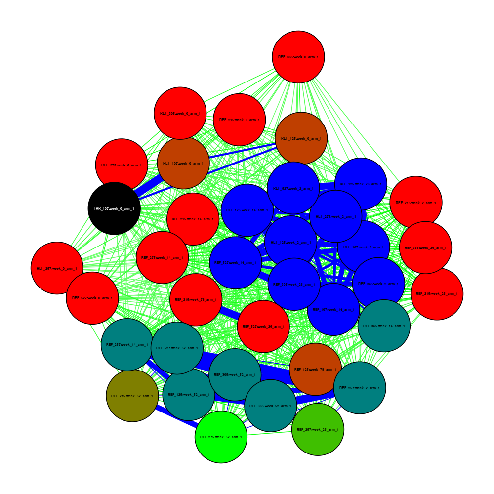
Again, we run Pheno-Ranker in cohort mode, adding individuals.json and patient.json as if they were two cohorts, using jaccard as a metric:
pheno-ranker -r individuals.json patient.json --append-prefixes REF TAR --similarity-metric-cohort jaccard
Now we plot the resulting matrix.txt file, but this time the TAR_107:week_0_arm_1 (last element) node is colored black to be more visible.
Coloring Nodes and Edges:
- Nodes: Colored based on the count of connections exceeding a specified threshold, using a gradient from red (fewer connections) to blue (more connections).
- Edges: Colored by weight, with blue for the strongest connections (weight > 0.90), green for strong connections (weight > 0.50), and red for weaker ones.
 # Install the necessary packages if not already installed
 if (!requireNamespace("qgraph", quietly = TRUE)) {
     install.packages("qgraph")
 }
 library(qgraph)
 data <- as.matrix(read.table("matrix.txt", header = TRUE, row.names = 1, check.names = FALSE))

 # Start PNG device
 png(filename = "qgraph.png", width = 1000, height = 1000,
     units = "px", pointsize = 12, bg = "white", res = NA)

 # Toggle for coloring the last node black
 colorLastNodeBlack <- TRUE  # Change to TRUE for black / FALSE to retain original color

 # Function to determine color based on threshold values
 getColorBasedOnThreshold <- function(value, thresholdHigh, thresholdMid, colorHigh, colorMid, colorLow) {
   if (value > thresholdHigh) {
     return(colorHigh)
   } else if (value > thresholdMid) {
     return(colorMid)
   } else {
     return(colorLow)
   }
 }

 # Apply this function to each node and edge
 node_thresholds <- apply(data, 1, function(x) sum(x > 0.9))
 max_node_threshold <- max(node_thresholds)
 min_node_threshold <- min(node_thresholds)
 normalized_node_thresholds <- (node_thresholds - min_node_threshold) / (max_node_threshold - min_node_threshold)

 # Color nodes based on normalized threshold
 node_colors <- colorRampPalette(c("red", "green", "blue"))(length(unique(normalized_node_thresholds)))
 node_colors <- node_colors[as.integer(cut(normalized_node_thresholds, breaks = length(node_colors), include.lowest = TRUE))]

 # Conditionally color the last node black
 if (colorLastNodeBlack) {
     node_colors[length(node_colors)] <- "black"  # Last node in black
 }

 # Edge colors with similar logic
 edge_colors <- apply(data, c(1,2), function(x) getColorBasedOnThreshold(x, 0.90, 0.50, "blue", "green", "red"))
 edge_colors <- matrix(edge_colors, nrow=nrow(data), ncol=ncol(data))

 # Create and plot the graph
 qgraph(data,
        labels=colnames(data),
        layout='spring',
        label.font=2,  # Bold labels
        vsize=10,      # Node size
        threshold=0.50,  # Edge visibility threshold
        shape='circle',
        color=node_colors,  # Node colors
        edge.color=edge_colors,  # Edge colors
        edge.width=1)  # Edge width

 # Close the device to save the PNG file
 dev.off()
See code
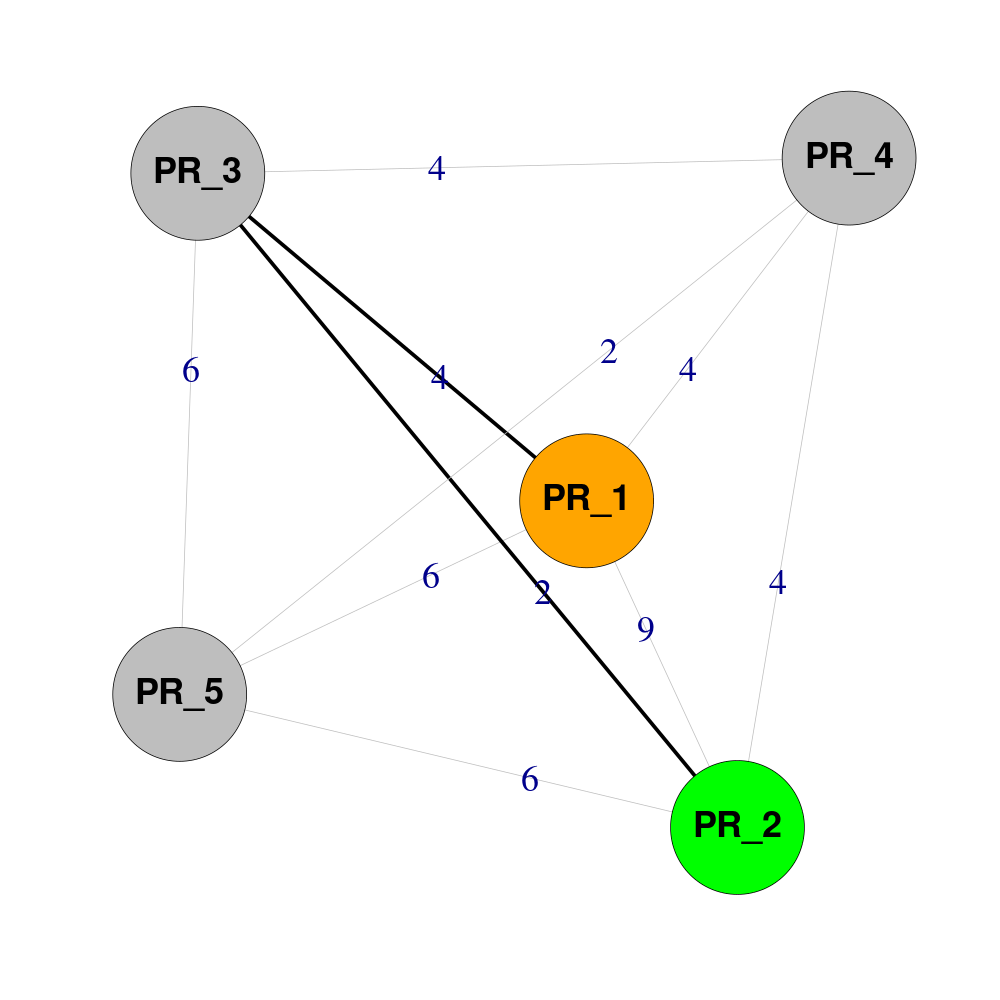
Imagine that Pheno-Ranker has created a matrix.txt with this content:
| PR_1 | PR_2 | PR_3 | PR_4 | PR_5 | |
|---|---|---|---|---|---|
| PR_1 | 0 | 9 | 4 | 4 | 6 |
| PR_2 | 9 | 0 | 2 | 4 | 6 |
| PR_3 | 4 | 2 | 0 | 4 | 6 |
| PR_4 | 4 | 4 | 4 | 0 | 2 |
| PR_5 | 6 | 6 | 6 | 2 | 0 |
You want to know the shortest path between PR_1 and PR_2 (Hamming distance = 9). Let's process it with R:
 # Install the necessary packages if not already installed
 if (!requireNamespace("igraph", quietly = TRUE)) {
     install.packages("igraph")
 }
 library(igraph)

 # Define start and end nodes
 START_NODE <- "PR_1"
 END_NODE <- "PR_2"

 # Read the data matrix from a file, assuming it's a distance matrix
 data <- as.matrix(read.table("matrix.txt", header = TRUE, row.names = 1, check.names = FALSE))

 # Adjust weights of zero to a small positive value for calculation
 data[data == 0] <- 1e-10

 # Create an igraph graph from the adjusted distance matrix
 g <- graph_from_adjacency_matrix(data, mode = "undirected", weighted = TRUE, diag = FALSE)

 # Set node names
 V(g)$label <- V(g)$name  # assuming node names are already defined

 # Find the shortest paths between START_NODE and END_NODE
 shortest_path <- shortest_paths(g, from = START_NODE, to = END_NODE, mode = "out", output = "vpath")

 # Extract the edges in the shortest path
 edges_in_path <- E(g, path = unlist(shortest_path$vpath))

 # Define colors for vertices and edges
 vertex_colors <- ifelse(V(g)$name == START_NODE, "orange", ifelse(V(g)$name == END_NODE, "green", "grey"))
 edge_colors <- ifelse(E(g) %in% edges_in_path, "black", "grey")
 edge_widths <- ifelse(E(g) %in% edges_in_path, 3, 0.2)

 # Prepare edge labels to display original values
 edge_labels <- ifelse(E(g)$weight == 1e-10, 0, E(g)$weight)

 # Start PNG device
 png(filename = "igraph.png", width = 1000, height = 1000,
     units = "px", pointsize = 12, bg = "white", res = NA)

 # Plot the graph
 plot(g, layout = layout_nicely(g),
      edge.label.cex = 3,  # Edge label size
      edge.color = edge_colors,
      edge.width = edge_widths,
      edge.label = edge_labels,  # Use adjusted labels for display
      label.font=2,  # Bold labels
      label.distance = 1,
      vertex.color = vertex_colors,
      vertex.size = 40,  # Increased node size
      vertex.label.cex = 3.0, # Size of labels
      vertex.label.color = "black", # Label color
      vertex.label.font = 2, # Bold labels
      vertex.label.family = "sans", # Font family
      vertex.label.fontcolor = "black") # Font color
 dev.off()
Installation
From where can I download the software?
See Download & Installation. It summarizes CPAN, Conda, GitHub checkout, Docker Hub, and Dockerfile-based installation paths.
Do you have a way of installing R (+ plotting libraries) along with Pheno-Ranker?
R is not required to run the pheno-ranker CLI. Use R when you want to post-process outputs such as matrix.txt, rank.txt, matrix.mtx, or exported JSON files.
If you want to call pheno-ranker from R, see Use from R. For containerized installations, see Download & Installation and the Docker instructions linked from that page.