Cohort Mode
Cohort mode performs an all-vs-all comparison of records in one or more cohorts. Each record is flattened, encoded as a binary vector, and compared with either Hamming distance or the Jaccard index.
Use cohort mode when you want to explore the structure of a cohort, compare multiple cohorts, identify clusters, run dimensionality reduction, or export a graph for network analysis.
matrix.txtWhat You Get
matrix.txt: the default dense pairwise comparison matrix.- An optional Cytoscape-compatible graph and graph summary statistics.
- Optional intermediate hashes, vectors, labels, and coverage statistics.
matrix.mtx: optional sparse Matrix Market output for large matrix workflows.
Desktop also provides heatmap, network, and MDS/UMAP viewers for the outputs generated by a run. With the CLI, saved outputs can be explored in R or other analysis tools.
For target-to-reference ranking instead, see Patient Mode. For custom categorical records, see the Generic JSON tutorial.
Usage
Both interfaces calculate the same pairwise scores for the same inputs and settings.
- Desktop
- CLI
- Select Cohort comparison, then choose an input source. For a first run, select Examples > Load example.
- For your own data, select one or more reference files under User files. Add any required configuration under Advanced settings.
- Choose the Metric under Customize analysis. Under Output options, choose the matrix format, graph export, and projection.
- Select Run analysis, then open the completed run to explore Heatmap, MDS, Network, or Output files.
For a saved dense matrix, Add projection creates an MDS or UMAP run without repeating the pairwise comparisons. Use Expand to view a plot at full size. See the Desktop guide for the result viewer.
pheno-ranker -r individuals.json
This creates matrix.txt using Hamming distance. To compare several cohorts,
pass their files after -r. Use --similarity-metric-cohort jaccard for Jaccard
similarity and --cytoscape-json for graph export.
See the CLI Reference for all options.
Read the Results
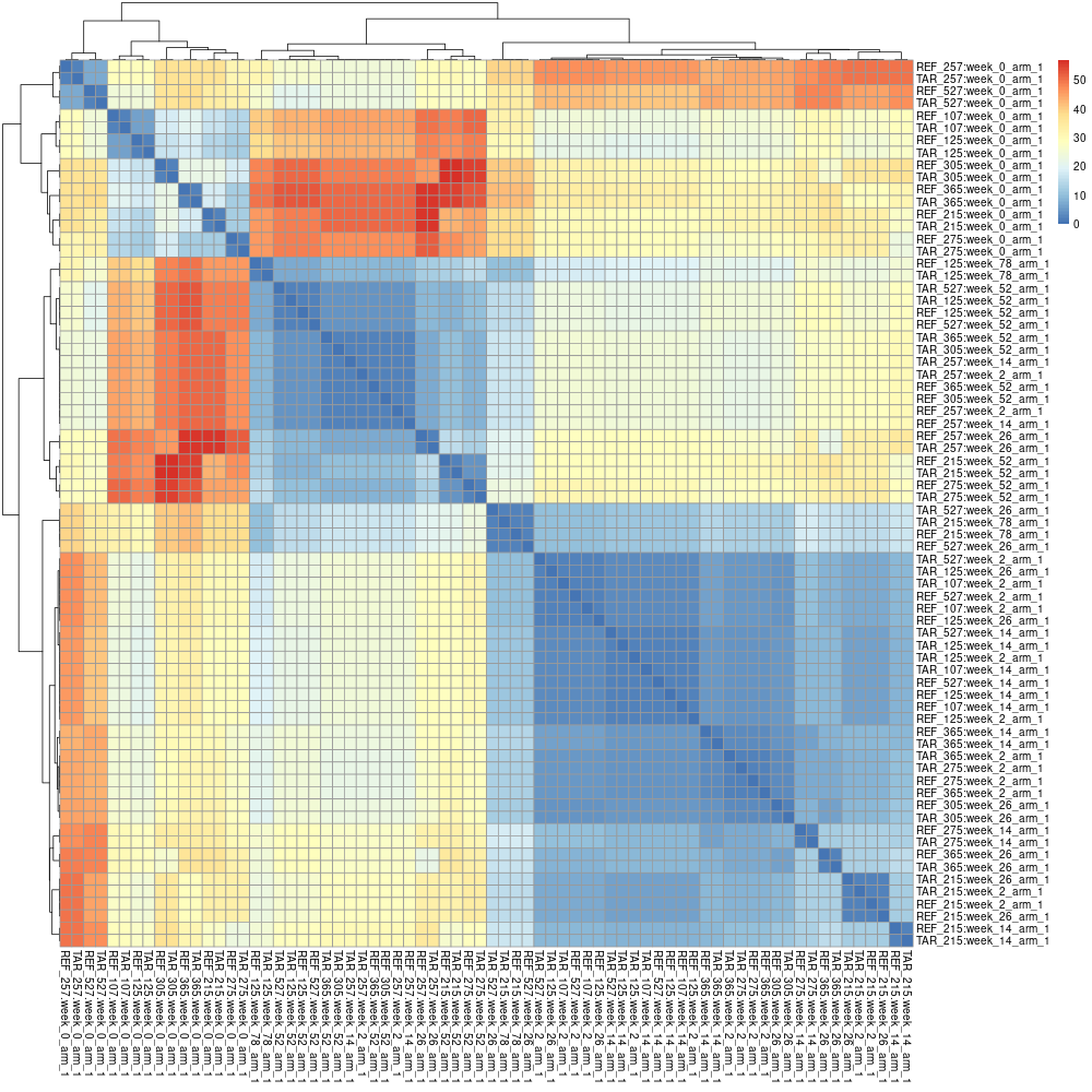
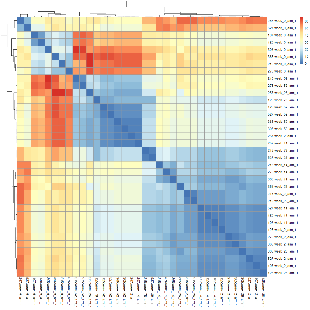
Each matrix cell compares two records. Lower Hamming distances mean fewer differences; higher Jaccard similarities mean a larger proportion of shared variables. The matrix is symmetric, with self-comparisons on the diagonal.
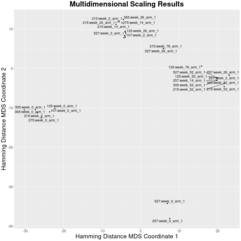
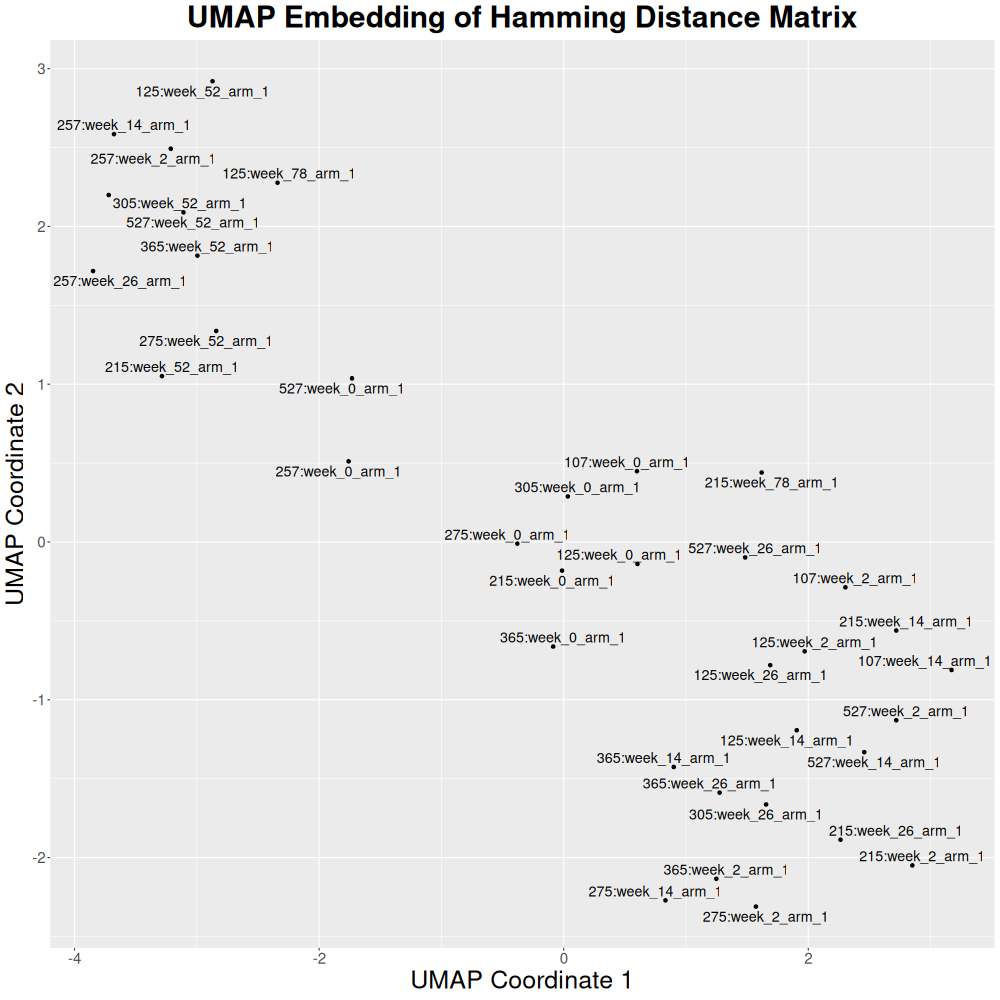
Heatmaps show the matrix values. MDS and UMAP summarize relationships in two
dimensions, so visible distances are an approximation. Networks show the
exported pairs that meet the chosen edge filters. For Jaccard, projections use
distance calculated as 1 - similarity.
When multiple cohorts are supplied, record prefixes identify their source. In Desktop, this source information also colours projection points and network nodes. Large files may exceed interactive preview limits; the full exported matrix remains available.
CLI and R Examples
Commands, sample outputs, and R plotting recipes
- Intra-cohort
- Inter-cohort
For this example, we use individuals.json, a JSON array with 36 patients. The goal is to compare every patient against every other patient in the file.
Download the file:
curl -L https://raw.githubusercontent.com/CNAG-Biomedical-Informatics/pheno-ranker/main/t/data/individuals.json -o individuals.json
Now run Pheno-Ranker:
pheno-ranker -r individuals.json
More input examples
You can find more input examples here.
This process generates matrix.txt, a 36 x 36 matrix calculated with
Hamming distance.
Preview matrix.txt
| 107:week_0_arm_1 | 107:week_2_arm_1 | 107:week_14_arm_1 | 125:week_0_arm_1 | 125:week_2_arm_1 | |
|---|---|---|---|---|---|
| 107:week_0_arm_1 | 0 | 24 | 23 | 6 | 23 |
| 107:week_2_arm_1 | 24 | 0 | 3 | 22 | 3 |
| 107:week_14_arm_1 | 23 | 3 | 0 | 21 | 2 |
| 125:week_0_arm_1 | 6 | 22 | 21 | 0 | 21 |
| 125:week_2_arm_1 | 23 | 3 | 2 | 21 | 0 |
This is the upper-left portion of the complete 36 x 36 matrix. With the default Hamming distance, smaller values indicate more similar records. The diagonal is zero because each record is identical to itself, and the matrix is symmetric.
Defining the similarity metric
Use --similarity-metric-cohort to choose the cohort metric. The default value is hamming; the alternative is jaccard.
pheno-ranker -r individuals.json --similarity-metric-cohort jaccard
Sparse Matrix Market output
By default, cohort mode writes a dense tab-separated matrix (matrix.txt). For large cohorts, you can instead write a sparse Matrix Market coordinate file:
pheno-ranker -r individuals.json --matrix-format mtx -o matrix.mtx
The mtx format stores one triangle of the symmetric matrix and writes only non-zero values. It is always RAM-light and does not use the dense in-memory matrix cache controlled by --max-matrix-records-in-ram.
The Matrix Market file includes comment lines mapping 1-based matrix indexes back to individual IDs:
% id 1 107:week_0_arm_1
% id 2 107:week_2_arm_1
Matrix output and Cytoscape graph output are generated independently. This means --matrix-format mtx can be combined with --cytoscape-json.
Exporting intermediate files
It is possible to export all intermediate files, as well as a file indicating coverage, with --export (--e).
Examples:
pheno-ranker -r individuals.json --export
pheno-ranker -r individuals.json --export my_fav_id # choose a prefix
The intermediate files can be used for further processing (e.g., import to a database; see FAQs) or to make informed decisions. For instance, the file export.coverage_stats.json has stats on the coverage of each term (1D-key) in the cohort. It is possible to go more granular with a tool like jq that parses JSON. For instance:
jq -r 'to_entries | map(.key + ": " + (.value | length | tostring))[]' < export.ref_hash.json
This command will print how many variables per individual were actually used to perform the comparison. You can post-process the output to check for unbalanced data.
Analyze the matrix
The matrix can be read by R or another statistical environment for clustering and dimensionality reduction. See Use from R for a concise, cross-platform workflow.
Show the complete clustering, MDS, UMAP, and graph examples
The corresponding scripts are available in the R directory on GitHub.
Clustering
The matrix can be processed to obtain a heatmap:
R code
# Load library
library("pheatmap")
#library("heatmaply") # could not install

# Read in the input file as a matrix
data <- as.matrix(read.table("matrix.txt", header = TRUE, row.names = 1, check.names = FALSE))

# Save image
png(filename = "heatmap.png", width = 1000, height = 1000,
    units = "px", pointsize = 12, bg = "white", res = NA)

# Create the heatmap with row and column labels
#heatmap(data, Rowv = FALSE, Colv = FALSE, labRow = rownames(data), labCol = colnames(data))
pheatmap(data)
#heatmaply(data)
#dev.off()
Dimensionality reduction
The same matrix can be processed with multidimensional scaling to reduce the dimensionality.
R code
library(ggplot2)
library(ggrepel)

# Read in the input file as a matrix
data <- as.matrix(read.table("matrix.txt", header = TRUE, row.names = 1, check.names = FALSE))

# Calculate distance matrix
#d <- dist(data)
#d <- 1 - data  # J-similarity to J-distance

# Perform multidimensional scaling
#fit <- cmdscale(d, eig=TRUE, k=2)
fit <- cmdscale(data, eig=TRUE, k=2)

# Extract (x, y) coordinates of multidimensional scaling
x <- fit$points[,1]
y <- fit$points[,2]

# Create data frame
df <- data.frame(x, y, label=row.names(data))

# Save image
png(filename = "mds.png", width = 1000, height = 1000,
    units = "px", pointsize = 12, bg = "white", res = NA)

# Create scatter plot
ggplot(df, aes(x, y, label = label)) +
  geom_point() +
  geom_text_repel(size = 5, # Adjust the size of the text
                  box.padding = 0.2, # Adjust the padding around the text
                  max.overlaps = 10) + # Change the maximum number of overlaps
  labs(title = "Multidimensional Scaling Results",
       x = "Hamming Distance MDS Coordinate 1",
       y = "Hamming Distance MDS Coordinate 2") + # Add title and axis labels
  theme(
        plot.title = element_text(size = 30, face = "bold", hjust = 0.5),
        axis.title = element_text(size = 25),
        axis.text = element_text(size = 15))

#dev.off()
Or the dimensionality can be reduced with UMAP:
R code
# -- Install uwot on the fly if needed
if (!requireNamespace("uwot", quietly = TRUE)) {
    install.packages("uwot", repos="https://cloud.r-project.org")
}

# -- Load libraries
library(uwot)
library(ggplot2)
library(ggrepel)

# -- Read in the input file as a full distance matrix
data <- as.matrix(
    read.table("matrix.txt",
               header=TRUE,
               row.names=1,
               check.names=FALSE)
)

# -- Convert to a 'dist' object so uwot knows these are distances
d <- as.dist(data)

# -- Set seed for reproducibility
set.seed(42)

# -- Run UMAP directly on the distances
#    Passing a 'dist' object lets uwot build the k-NN graph from your distances
umap_res <- umap(
    d,
    n_neighbors=30,
    min_dist=0.3,
    n_components=2
)

# -- Extract UMAP coordinates
x <- umap_res[,1]
y <- umap_res[,2]

# -- Build a data frame for plotting
df <- data.frame(
    x=x,
    y=y,
    label=rownames(data)
)

# -- Open PNG device
png(filename="umap.png",
    width=1000,
    height=1000,
    units="px",
    pointsize=12,
    bg="white",
    res=NA)

# -- Create scatter plot with labels
ggplot(df, aes(x=x, y=y, label=label)) +
    geom_point() +
    geom_text_repel(
        size=5,
        box.padding=0.2,
        max.overlaps=10
    ) +
    labs(
        title="UMAP Embedding of Hamming Distance Matrix",
        x="UMAP Coordinate 1",
        y="UMAP Coordinate 2"
    ) +
    theme(
        plot.title=element_text(size=30, face="bold", hjust=0.5),
        axis.title=element_text(size=25),
        axis.text=element_text(size=15)
    )

# -- Close the device
dev.off()
Graph analytics
Pheno-Ranker has an option for creating a graph in JSON format, compatible with the Cytoscape ecosystem.
Bash code for Cytoscape-compatible graph/network
pheno-ranker -r individuals.json --cytoscape-json
This command generates a graph.json file, as well as a matrix.txt file. The graph is generated directly from the binary comparison hashes, not by parsing the matrix file, so it can also be combined with Matrix Market output:
pheno-ranker -r individuals.json --matrix-format mtx -o matrix.mtx --cytoscape-json graph.json
Large graphs can be filtered by edge weight:
# Hamming distance: keep close pairs
pheno-ranker -r individuals.json --cytoscape-json --graph-max-weight 10

# Jaccard similarity: keep highly similar pairs
pheno-ranker -r individuals.json --similarity-metric-cohort jaccard --cytoscape-json --graph-min-weight 0.7
To produce summary statistics, use:
pheno-ranker -r individuals.json --cytoscape-json --graph-stats
This command will produce a file called graph_stats.txt. For additional information, see the generic JSON tutorial.
We use individuals.json again, but pass it twice to simulate two cohorts. Pheno-Ranker adds a CX_ prefix to the primary_key values so each record can be traced back to its source cohort.
pheno-ranker -r individuals.json individuals.json
Absolutely, a cohort can indeed be composed of a single individual. This allows for an analysis involving both a cohort and specific patient(s) simultaneously.
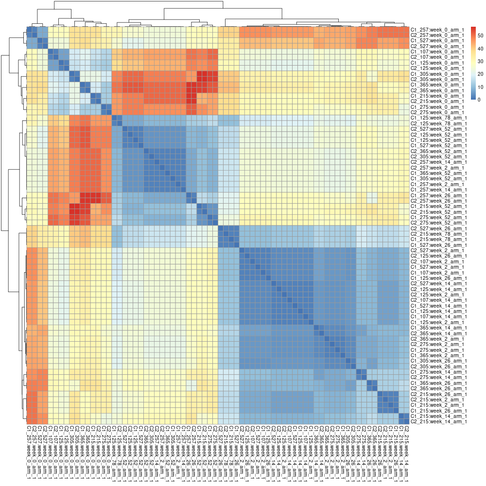
The prefixes can be changed with the flag --append-prefixes:
pheno-ranker -r individuals.json individuals.json --append-prefixes REF TAR
This will create a matrix.txt file of (36+36) x (36+36) cells. Again, this matrix can be processed with R: